Tag: data
One year of cube solve timings (Jan. 2018 – Jan. 2019)
 A year ago, I bought a $6 Duncan-branded “Quick Cube” after my last cube started literally falling apart. Since then, I’ve kept the cube at my desk and recorded timings throughout each day. The following is a visualization of a year’s worth of timings:
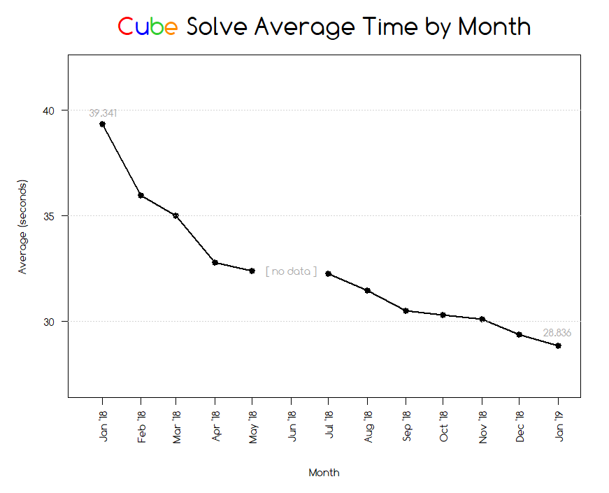 Sample count is about 12,500 which comes out to about 34 solves per day (wow…). Fastest solve for the year was 13.071 seconds due to some luck. I solve using a variation of a beginner’s method that was taught in the instructions that came with my first cube.
Beginner’s method steps (steps in red are combined in my method)
- Solve a cross on first layer
- Solve first layer corners
- Solve second layer
- Cross on last layer
- Last layer edges
- Last layer corners
- Orient the last layer corners
I used the same method all year. There exist plenty of methods that are way faster than mine but I’m not interested in dedicating the time to memorizing the algorithms involved. For anyone wondering, world record average of 5 solves is somewhere around 5.97 seconds (held by Feliks Zemdegs).
Sub-30s is fine enough for me. I consider that a goal reached and have no plans of pushing it further.
Data captured using the Cube Timer app on Android. Exported to csv and visualized using R.
A Heat Map
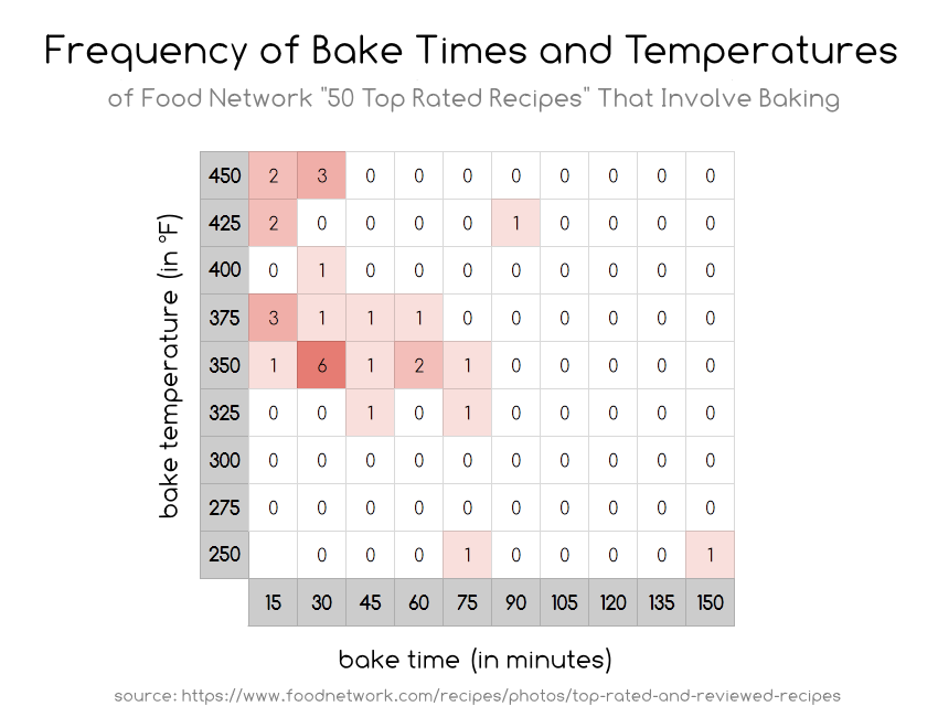
Only included the 31 of the 50 in the list that involved one baking step. Bake times rounded to the nearest 15 minutes. Weird outlier is a recipe for ribs–baked for 2.5 hours at 250°F.
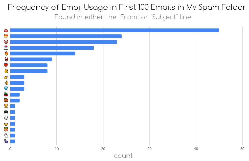
Emoji Spam
Frequency of Scores in the NHL 2017-2018 Regular Season
“How many goals are usually scored in a hockey game?”
I had this question the other day and wanted to find out. A quick google search gave me this list of all game results from the 2017-2018 season. I wanted to visualize this data so decided to use R to generate a heat map of score frequencies.
Eventually, I ditched using R because I couldn’t for the life of me get the graphs to look pretty. Meanwhile, a copy and paste of data into Google Sheets and a couple minutes of clicking gave me the output I wanted. Friendly reminder to all to use the appropriate tool for the task.
Here’s what I found:
 This answers the original question–most hockey games will end around the neighborhood of a 2-1, 3-2, or 4-3 score. I posted this on Reddit and an interesting question was asked a few times. What would this graph look like if I adjusted scores in overtime and shootout wins? In the NHL, if a team ends in the 3rd period with a tied score, they go into a 3v3 5-minute sudden-death overtime period. If no goal is scored during that overtime, the teams go into a shootout. Ultimately, one team will win and will be award the extra point onto their score.
This could be inflating the frequency of “N to N-1” scores.
I found the easiest way to adjust for overtime and shootout wins was to simply take all games that ended with an OT or SO and subtract one point from the winning team–essentially turning the chart into the scores at the end of the third period of regulation. Here is that adjusted chart:
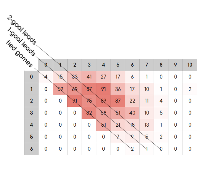
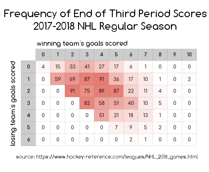 Now this is interesting. Updated observations: Most hockey games fall around the 3ish to 7ish total goals scored and there is a higher frequency of games ending in ties and games ending in 2-goal leads than there is of games ending in 1-goal leads. Notice that cells in the diagonal for 1-goal leads are lower in frequency than their neighbors to the right and to the bottom. e.g. a 1-0 score happened 15 times, but a 2-0 score happened 33 times and a 1-1 score happened 59 times. This continues until the sample sizes drop.
Why would this be? The simplest explanation would probably be the strategy of trailing teams pulling their goalie in the final moments of the third period.
In the NHL, the season is structured in the following way. All teams compete over the course of 82 games, each, and acquire points for each game win/loss/overtime or shootout. These accumulated points determine playoff seeding at the end of the season. The league awards 2 points for each win, 1 point for each overtime or shootout loss, and 0 points for each loss that doesn’t go into overtime. That means that a regulation loss is a loss, no matter what the score differential was by the end of the game.
In addition to the season structure, NHL rules allow for the goalie to be replaced with an extra skater at any point during play. Thus, it has become very common in the NHL for a team that is trailing by 1 in the final moments of the third period to replace their goalie with another skater in desperation. This makes sense. If our team is trailing by a goal, and it doesn’t matter in terms of playoff seeding points if we lose by another goal, it is worth the risk for us to do what we can to tie the game and send the game into overtime to maybe squeeze 1 point out of this game to affect our overall playoff standings.
Putting it all together, the NHL season structure + the rules for pulling a goalie could be contributing factors to inflation of frequencies of tied games (pulling the goalie worked) and games that ended in a 2 goal lead (pulling the goalie backfired and the other team scored on an empty net).
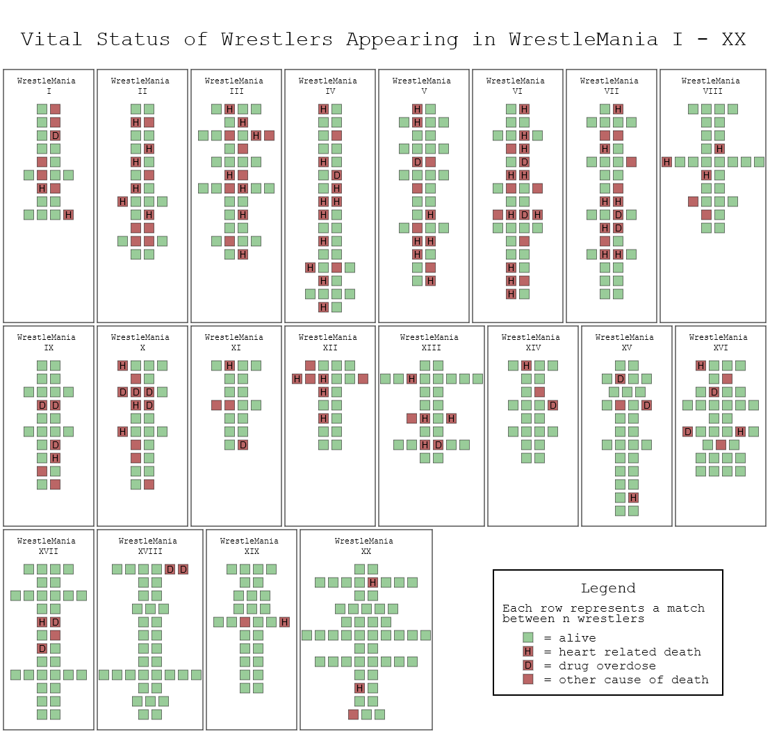
Vital Status of Wrestlers Appearing in WrestleMania I – XX
Jim “The Anvil” Neidhart, passed away yesterday. Neidhart was a wrestler from the WWF that I followed in the early 90s. He passed away at the age of 63.
I noticed that a lot of wrestlers that I watched as a kid have been passing away at relatively young ages. Furthermore, I noticed a trend that many of the deaths (not in Neidhart’s case) were drug or heart related. This made sense to me because a selection bias likely exists in this area where Wrestlemania participants are more likely than the average population to abuse steroids and other drugs. I wanted to visualize how many of these deaths were related to drugs or heart causes so here’s a thing I made:
The following is a visualization I crudely threw together using data from wikipedia entries as of 8/13/2018 and html5 canvas API. I’ve chosen WrestleManias 1 – 20 to visualize because these were roughly around the era I was most familiar with.
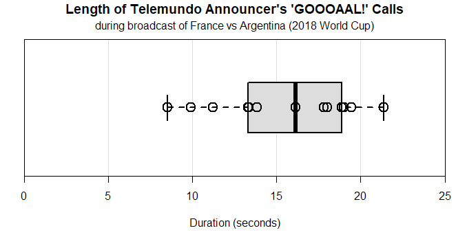
Goooooooaaaaallllllllllllllllllll!
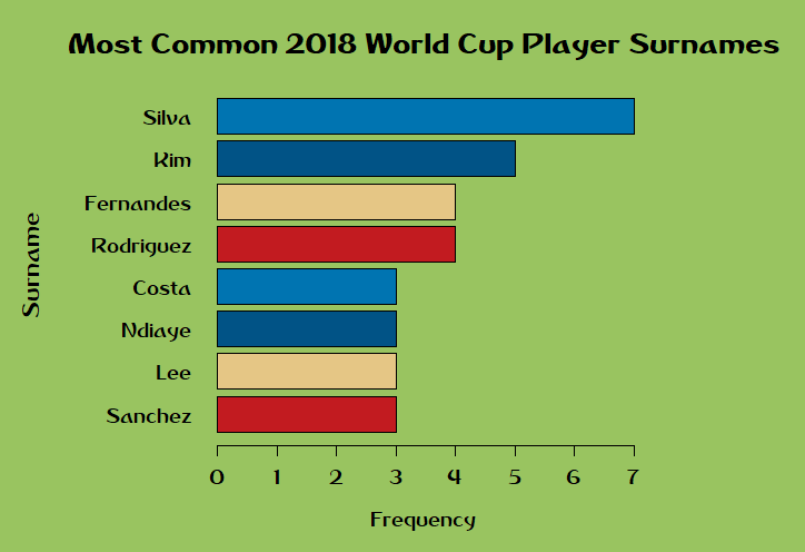
What Are the Most Common Surnames of World Cup Players?
Prompted by my observation that South Korea’s National Team has 5 different players with the surname “Kim”. I wondered if there was a more common surname in the World Cup. Used this little question as an excuse to continue tinkering with R and using data from data.world
How Important is Height in Hockey?
During my last recreational league hockey season, my captain had me play center. My favorite part (aside from face-offs) was the increased defensive responsibilities. I think it would be a fun idea to switch to defense for a season. However, I’m a bit concerned that at 5’7″ (67 inches) tall, I would be seen as too small to effectively play defense. I decided to check NHL stats and throw something together in R. Data includes all players currently in the NHL as of June 20, 2018.
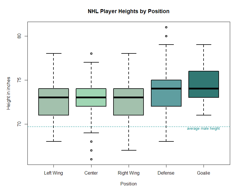
Based on my findings, it looks like there is a lot of variation across each position. Sure, the trend seems to be that players are taller the further back in the rink they are, but there is a lot of overlap in distributions of heights for each position.
- Median heights across all players is only about 3-5 inches taller than average males
- Roughly speaking, centers and wings are around the same height
- Heights for defensemen closely resemble the spread of heights for forwards, but shifted up about an inch
- Goalie is the one position where someone of my height playing the position would be a large outlier
After seeing the data, I don’t think that hockey has too much specialization based on height. Yeah, I’m not the tallest person, but especially for a rec league, I shouldn’t be discouraged from playing any position. I’ll sign myself up to play D next season.
Who are the Sharks’s Playmakers?
Similar to the last post, here is a visualization made with R of the players’ assists awarded over the last 5 seasons. Graph only includes players with at least 5 full NHL seasons of data and is not adjusted for games missed due to injuries.
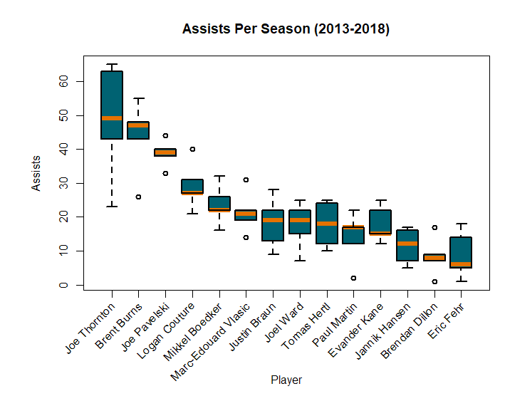
- Note: Mikkel Boedker was traded this morning to the Ottawa Senators.
- There weren’t any particularly notable exclusions from this list. Closest might be Kevin Labanc, who had a season high 29 assists last season, but only 2 full seasons of data to pull from.
- I mentioned Patrick Marleau in the last post. If he were included in this post, he’d fall around where Mikkel Boedker or Logan Couture are listed: He has a median assists count of 23 with a 5-season high of 38 in 2014-2015.
- John Tavares has a 5-season median of 42 assists with a high of 48 assists in 2014-205. If John Tavares were inserted into this graph, he’d fall right between Burns and Pavelski. Not bad!