“How many goals are usually scored in a hockey game?”
I had this question the other day and wanted to find out. A quick google search gave me this list of all game results from the 2017-2018 season. I wanted to visualize this data so decided to use R to generate a heat map of score frequencies.
Eventually, I ditched using R because I couldn’t for the life of me get the graphs to look pretty. Meanwhile, a copy and paste of data into Google Sheets and a couple minutes of clicking gave me the output I wanted. Friendly reminder to all to use the appropriate tool for the task.
Here’s what I found:
 This answers the original question–most hockey games will end around the neighborhood of a 2-1, 3-2, or 4-3 score. I posted this on Reddit and an interesting question was asked a few times. What would this graph look like if I adjusted scores in overtime and shootout wins? In the NHL, if a team ends in the 3rd period with a tied score, they go into a 3v3 5-minute sudden-death overtime period. If no goal is scored during that overtime, the teams go into a shootout. Ultimately, one team will win and will be award the extra point onto their score.
This could be inflating the frequency of “N to N-1” scores.
I found the easiest way to adjust for overtime and shootout wins was to simply take all games that ended with an OT or SO and subtract one point from the winning team–essentially turning the chart into the scores at the end of the third period of regulation. Here is that adjusted chart:
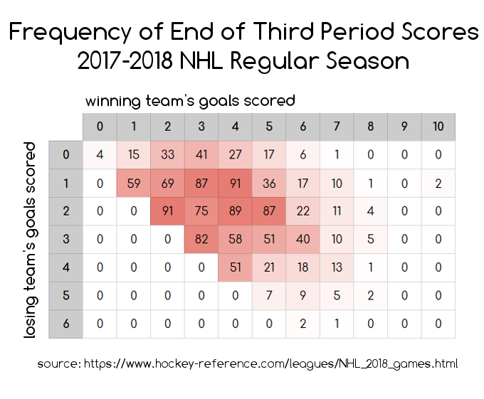 Now this is interesting. Updated observations: Most hockey games fall around the 3ish to 7ish total goals scored and there is a higher frequency of games ending in ties and games ending in 2-goal leads than there is of games ending in 1-goal leads. Notice that cells in the diagonal for 1-goal leads are lower in frequency than their neighbors to the right and to the bottom. e.g. a 1-0 score happened 15 times, but a 2-0 score happened 33 times and a 1-1 score happened 59 times. This continues until the sample sizes drop.
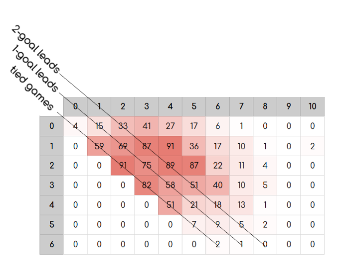
Why would this be? The simplest explanation would probably be the strategy of trailing teams pulling their goalie in the final moments of the third period.
In the NHL, the season is structured in the following way. All teams compete over the course of 82 games, each, and acquire points for each game win/loss/overtime or shootout. These accumulated points determine playoff seeding at the end of the season. The league awards 2 points for each win, 1 point for each overtime or shootout loss, and 0 points for each loss that doesn’t go into overtime. That means that a regulation loss is a loss, no matter what the score differential was by the end of the game.
In addition to the season structure, NHL rules allow for the goalie to be replaced with an extra skater at any point during play. Thus, it has become very common in the NHL for a team that is trailing by 1 in the final moments of the third period to replace their goalie with another skater in desperation. This makes sense. If our team is trailing by a goal, and it doesn’t matter in terms of playoff seeding points if we lose by another goal, it is worth the risk for us to do what we can to tie the game and send the game into overtime to maybe squeeze 1 point out of this game to affect our overall playoff standings.
Putting it all together, the NHL season structure + the rules for pulling a goalie could be contributing factors to inflation of frequencies of tied games (pulling the goalie worked) and games that ended in a 2 goal lead (pulling the goalie backfired and the other team scored on an empty net).