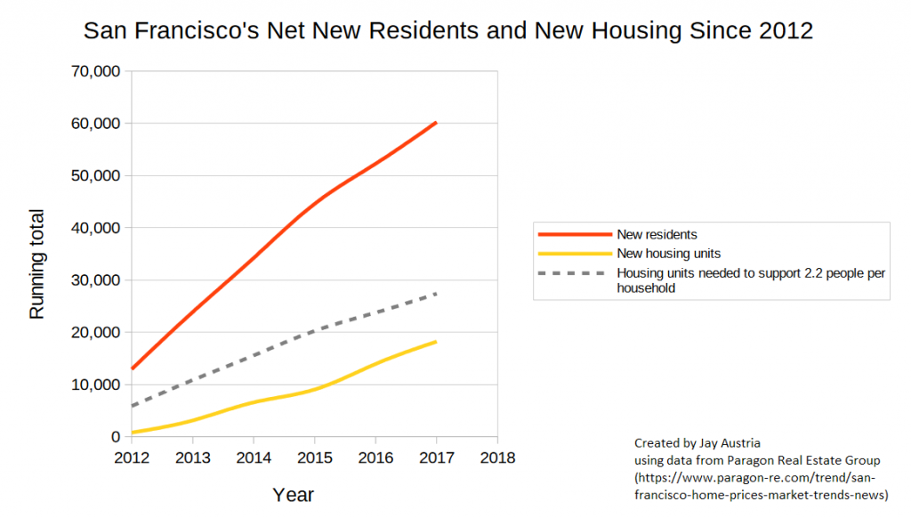
Made this for a class project to visualize SF’s lagging housing construction since 2012. This chart does not include any existing housing deficit prior to 2012, but just illustrates how even if the housing stock was perfectly adequate in 2012 (it wasn’t), construction over the following 6 years was insufficient. The red line shows the number of new residents added to San Francisco while the yellow line shows how much new housing has been added in the same period. There is also a dashed grey line which I added as a very rough estimate of where housing should be in order to keep up with the growing population by assuming a constant 2.2 people per household (SF’s number of people per household via the most recent Census data). Notice that the yellow line is quite a bit under the dashed grey line and that the slope of the yellow line doesn’t seem to indicate that it will catch up to the dashed grey line any time soon. This means that housing supply is short, will continue to remain short, and rents and home prices will remain high or rise until a) The red line chills out aka population growth slows, b) The yellow line picks up some speed aka SF accelerates its rate of housing development, or c) The grey line is redefined to be a smaller proportion of the red line aka San Franciscans get more used to packing more bodies into less housing. Option c may be tough, though, because by my math, the grey line doesn’t match the yellow until you start packing ~3.5+ people into each housing unit. With the majority of new housing being 2 bedrooms or smaller, San Franciscans might want to start embracing bunk beds.